A stylised N representing my site logo

Health Insurance (Part 2)

Overview

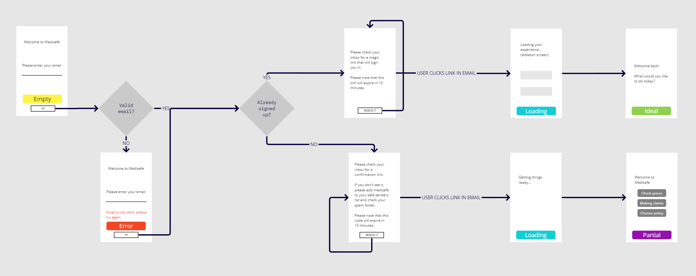
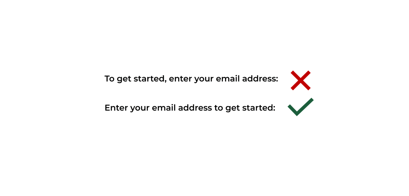
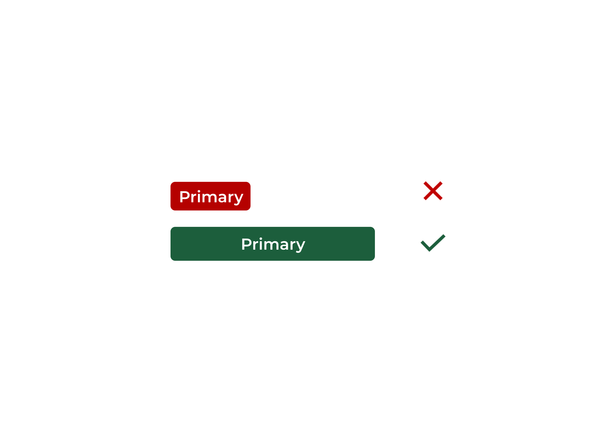
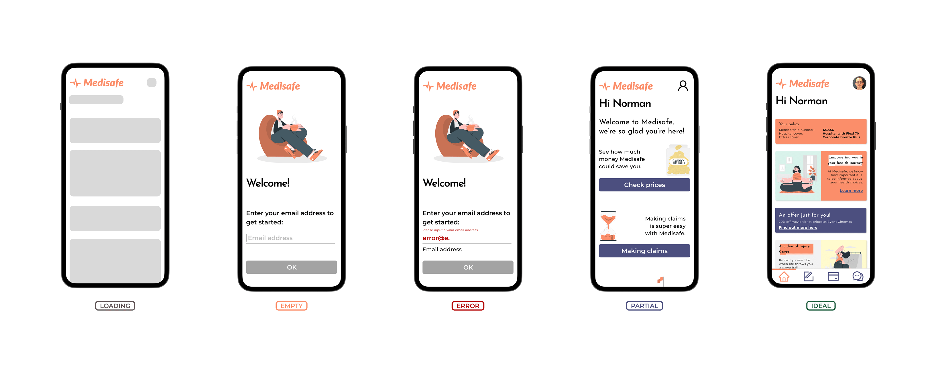
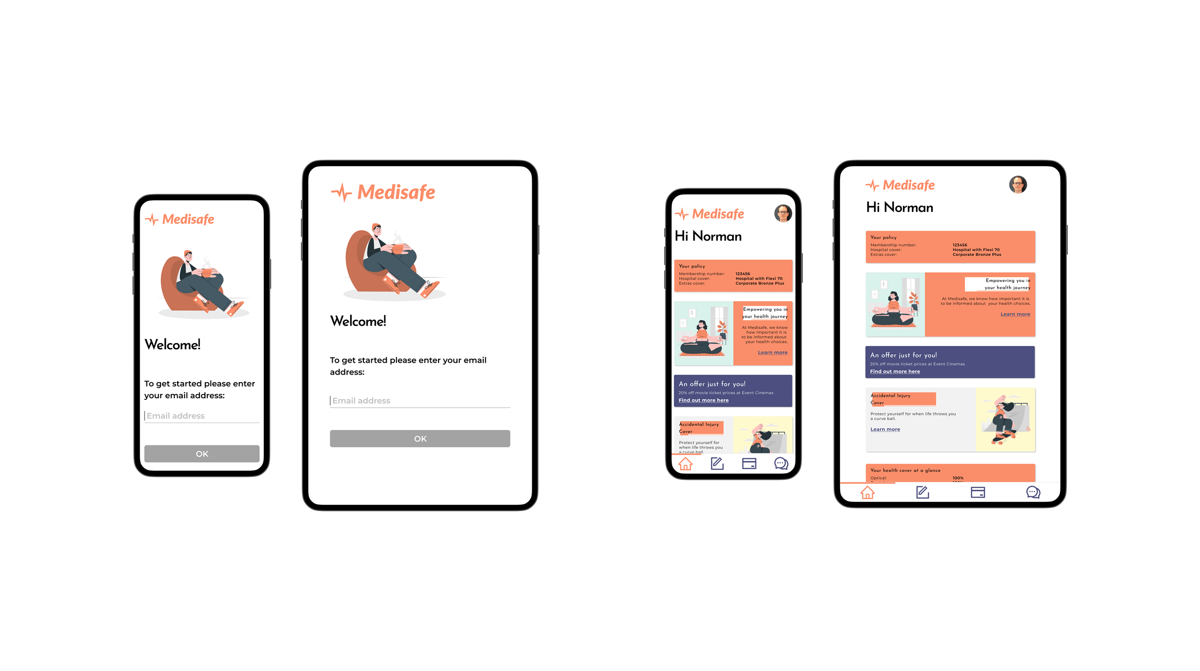
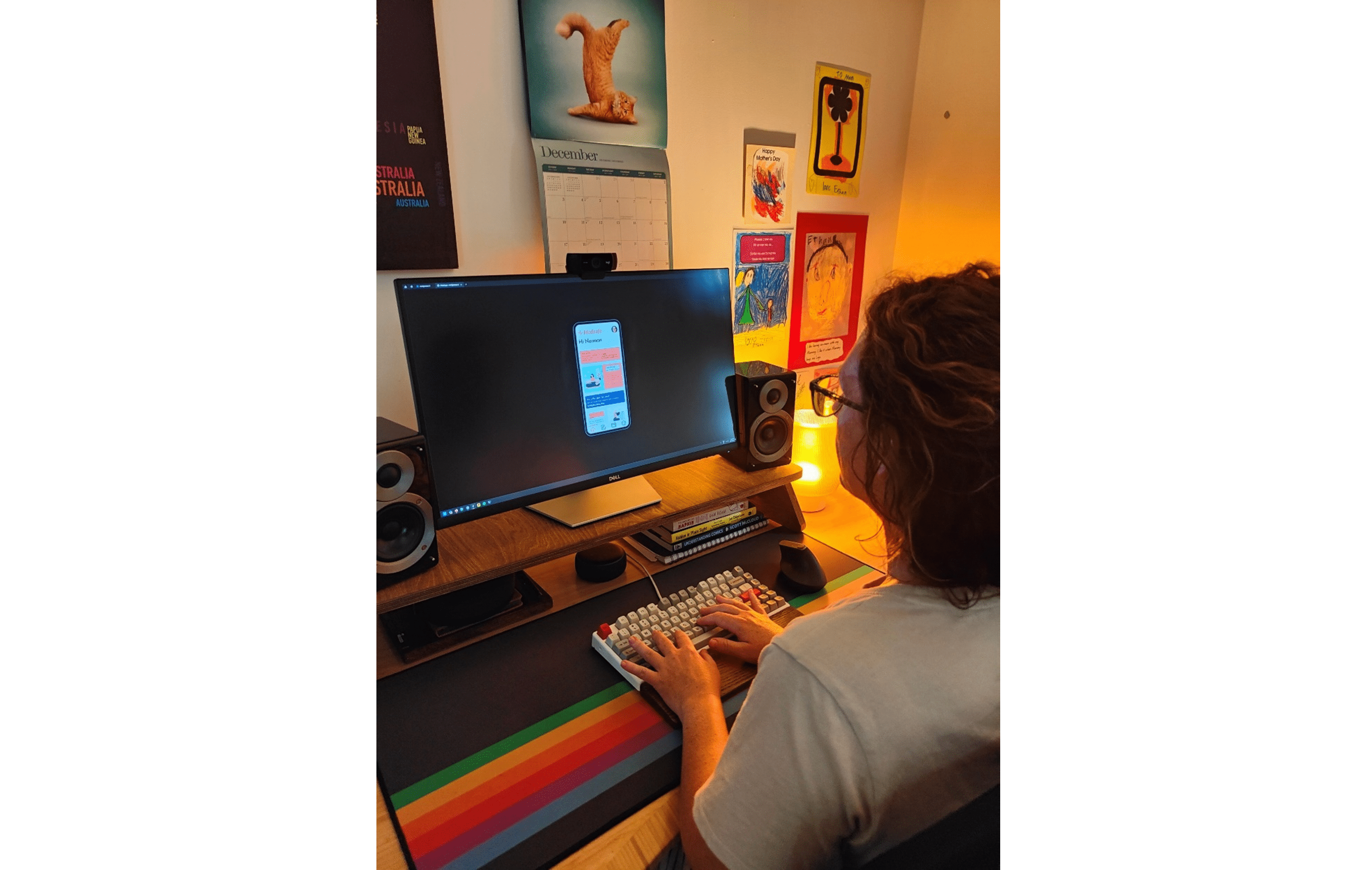
Medisafe, a fictional health insurance provider that primarily targets the 18 to 30-year-old market wants a mobile app with a seamless sign on experience.
As a UI Designer, I’ve been given the brief to create a mid-fidelity prototype to demonstrate sign on tailored to the tech-savvy audience Medisafe caters to.
Duration
4 weeks
Role
UI designer

Summary

  • This UX project focused on the development of a mid-fidelity prototype for Medisafe's mobile app sign-on experience, aimed at their target demographic of 18 to 30-year olds.
  • The design process included creating a user flow, a design system, prioritising accessibility, and considering responsive design for different resolutions.
  • User feedback was incorporated to improve the language clarity in the app.
  • This work could potentially enhance Medisafe's competitive edge, contributing to a larger user base and improved customer retention.

Intro

Medisafe is a health insurance provider operating in a crowded market of health insurance providers within Australia. They differentiate themselves by targeting the 18- to 30-year-old market, providing a product and services tailored to this demographic.
Until now, they haven’t had a dedicated mobile application, relying on their website to provide customers with the tools to sign up for insurance and manage their policies. Following research conducted by the Product Manager and the wider team, it is clear that to remain competitive within this crowded market, they need to provide their customers with a native experience that is intuitive and easy to use.

My Approach

Considering User Behaviour

Firstly, I took some time to consider the sign up from a user’s perspective. I created a user flow to illustrate the different paths and decisions a user signing up could take through the app.
This is useful, as it highlights what screens need to be developed, and what elements need to be represented at a minimum. It also highlights what transitional behaviour would assist the user to provide an appropriate level of feedback while using the app. This transitional behaviour and feedback is often summarised as the UI Stack, which I will discuss, later.
A user flow diagram showing the sign up process through our app

Building the Look

With an understanding of the app’s behaviour, I next focused on the app’s aesthetics.
I made a survey of competitors’ mobile apps, particularly those that offer services and products for the age group. I took note of their design language, focusing on colours, typography, icons, and general layout.
Different screen shots of various health mobile apps on the market
I created a mood board, picking colours, imagery, icons, and fonts to inspire the development of a design system.
A mood board for our proposed mobile app
This led to developing the design system, defining the overall style guide, UI components, and basic components used by the app. Defining this aims to increase design consistency and efficiency.
A design system showing styles, basic content, and components made up of styles and basic content

Considering Accessibility

The design story is never complete without considering accessibility. It is fundamental to modern application development. Some considerations that were made when developing the design system were:

Colours

Colours should be high contrast enough to be readable by people with low vision. Additionally, this is beneficial to people viewing their phones in suboptimal conditions, such as in bright rooms or when they are fatigued.
Colour palette

Language

Language should be clear and concise. The subject of the sentence should be front-loaded as this makes it easier to understand for people with cognitive impairments.
Examples of indirect and direct language

Hit Boxes

Use large hit boxes to make it easier for people with physical impairments to perform actions. Again, this is something that provides benefit to everyone.
Examples of small and large hit boxes

From Design to Prototype

At this point, I was ready to commence implementation of the prototype. As mentioned earlier, to develop an intuitive app that provides the appropriate level of feedback to the user at any point, I considered the UI stack. The UI stack comprises of 5 different states, allowing the user to properly understand what is happening when they are transitioning between pages in the app, or performing non-instantaneous actions, such as loading search results.
Screen shots from our mobile app demonstrating the UI stack
I also considered how the application would need to look at different resolutions, so created some mockups for the application on a mobile and a tablet.
Our mobile app displayed on mobile phones and tablets
At this stage, the portfolio was underway.
As the prototype was being developed, it was put in the hands of real users to gather feedback.
Overall, the feedback was generally favourable. This led to some minor updates being made to the prototype, particularly concerning some language that was used that didn’t communicate intent clearly.
A tester evaluating the mobile app prototype

Reflection

UI design is an area I enjoy. I have a deep curiosity when it comes to design tools such as Figma. Coming from a developer background, I understand the importance of having good tools. Design tools have a kind of maturity I am not used to when it comes to working with, for example, word processing applications such as Word. These tools are built from the ground up to enable efficient workflows that make a lot of sense once you get over the initial barrier to entry.
Concerning design itself, I am trying to make up for a lack of experience by leaning on proven wisdom. Gestalt principles, accessibility guidelines, design systems (such as Material design) all provide fertile ground for ideas I can use to improve the overall aesthetic and functionality of the designs I create. There is great benefit in taking inspiration from other designs as well. When a design doesn’t work it can be frustrating. When it does, it is incredibly satisfying. I’m trying to increase the latter by learning from the former.
Top